Background to phosphor displays and analog oscilloscopes
For all of you that have used analog oscilloscopes or other equipment with a phosphor display knows how beautiful the image can be from such displays. The color grading, which naturally occurs due to the persistence in the glow from the phosphor, also acts as a useful measurement on the signal integrity, such as how much noise there is and the shape/modulation of the underlying signal.
Modern oscilloscopes tries to simulate the same “look” by sampling large amounts and data which is processed and color shaded in a similar manner. However the resulting image is always inferior in both resolution and dynamic range due to the limitations in processing power and display technology, giving rise to aliasing problems when using time-base which is not optimal for the measured signal. At the time of writing this document (2016) high-dynamic-range displays and TVs are only starting to become available to the general public. However they are not yet available on oscilloscopes or other similar measurement equipment.
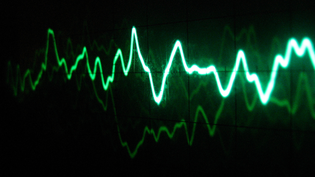
Comparing the digital image to a similar AM modulated signal on an analog oscilloscope immediately shows the large difference in color intensity when the signal overlaps. Another important aspect is the lighter color around the edges of the waveform, due to that a sine wave spends more time at the top and bottom than in the middle where the rise time is much faster. Thus even though we can not see the carrier wave in the photo below we can deduce that it must be a sine-wave or something very similar. If the carrier was a square-wave then there would not be any color in the middle of the larger waves, since a square wave spends all its time at the top or bottom. If the carrier was a triangle-wave then the color would be more uniform since it has a constant rise-time.
How to simulate the phosphor look
The characteristic look of a phosphor display stems from several factors:
- The data is drawn continuously by the electron beam forming lines between each data point.
- Color/light intensity increases the slower the electron beam moves or if the beam is drawn on top of itself several times.
- There is a glow around the area where the light is emitted.
- The exited phosphor coating emits its light during a longer time-period, even after the beam has left the spot (phosphor persistence).
The first characteristic can not simply be generated by drawing lines between each data point since you have to consider the speed by which the line is drawn in order to determine the intensity. This is dependent on the distance between the data points at a given sampling rate. Additionally there would never be precisely straight lines between each data point as sharp corners would require infinite frequency respons from the electronics.
So in my model for how to simulate the drawing of lines fills in the gap between each data point with many many extra points using a spline interpolation (giving rounded corners). If each gap is filled in with for example 1000 extra points then automatically a small gap will have many overlapping points when drawn on a finite raster of pixels, while a larger gap will have fewer overlapping points. Assigning a specific light intensity to each point (pixel) will then generate a lighter color where each pixel contains more points and a weaker color when there is only a few points inside each pixel.
In order to simulate the glow or spread around each line, a blur kernel can be applied. The most common blur kernel found in popular imaging softwares is the gaussian blur. However the glow around the drawn line on a real oscilloscope display does not follow a gaussian distribution as it originates from scattering of light between phosphorous coating particles. Instead a distribution is closer to an exponential shape is more realistic.
The calculated “intensity” for each pixel can also be modified based on the age (time since drawn) in order to simulate the phosphor persistence. For this an exponential decay fits well with experimental data of the length of the “afterglow” from phosphor displays. Hence both the a spatial decay (blur) and the temporal decay (fade over time) should have exponential distributions.

Finally, one has to also consider and simulate the behavior of a camera filming the display of an oscilloscope (also the behavior of a digital display playing the recording back). The camera has a finite shutter speed where all the light that is generated directly hits the sensor, light generated before the shutter is opened can still be seen due to afterglow of of the phosphor (exponential decay as explained above). Hence all data points drawn during the time that the shutter is opened should be drawn at full intensity and only data points drawn before that should be drawn with a decaying intensity.
Rendering of digital data and how to simulate the phosphor look
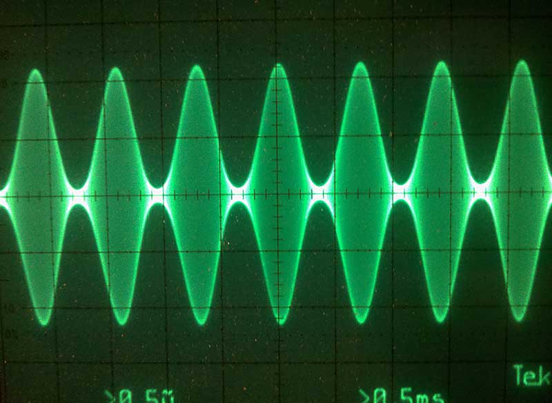
Plotting an AM modulated line/wave in a software such as Adobe Illustrator results in an uninteresting and aliased waveform (see below), due to the inability of handling overlapping or almost overlapping lines properly.
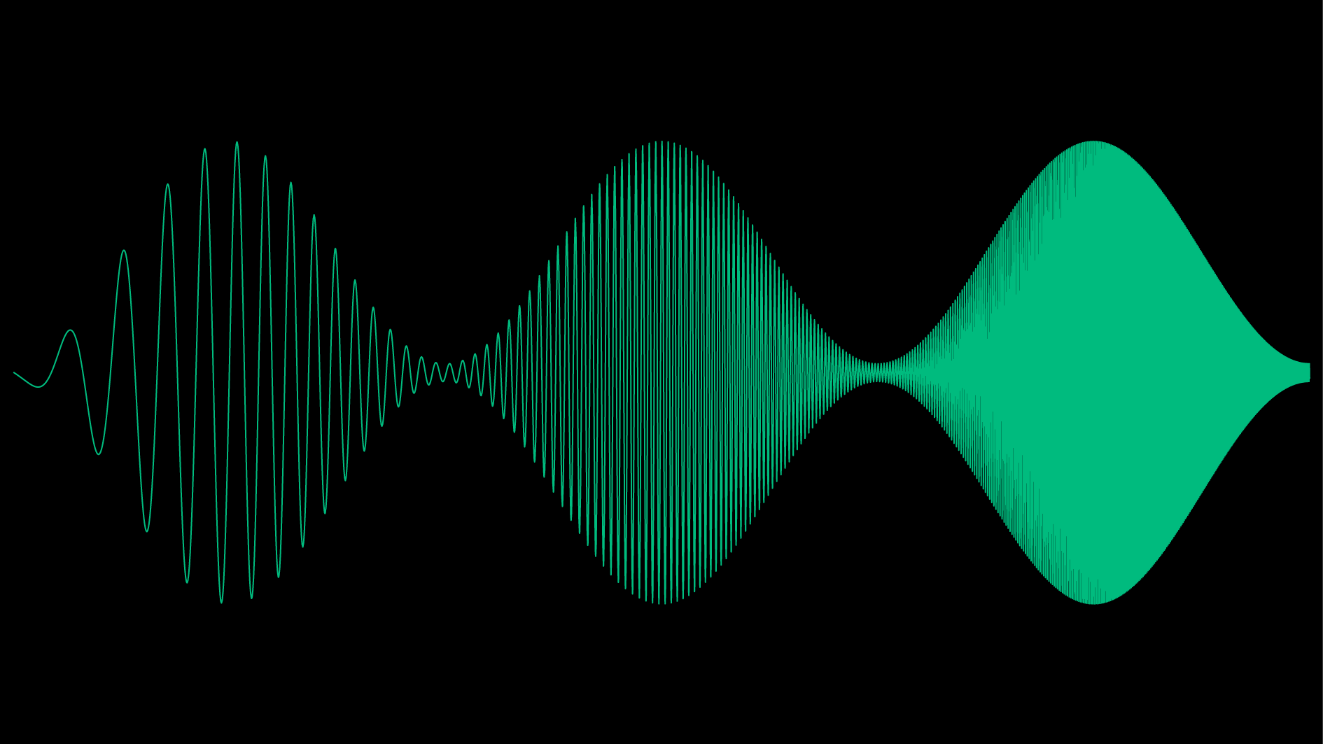
Rendering the same waveform using the simulated approach described above yields a much more realistic and interesting appearance:

There is a complete lack of aliasing or moiré patterns, which is overwise apparent in the previous image, especially when the spacing between the lines start to approach the pixel width of the image. In addition on the right most part of the wave, we no longer have a brick wall of filled pixels, there is a pleasant gradient in intensity between the middle and the outermost edge, which is to be expected of a modulated sine wave as the signal spends more time at the top and bottom than it does in the center. This can be compared to a triangle wave which have the same slope everywhere, or a square wave, which spends no time in the center and all the time at the top and bottom. Hence a trained eye can see that the carrier wave still consist of a sine wave even at the right most part of the figure, even though the individual lines can not be seen.
The code for rendering the above image, as well as the animation in the YouTube link below can be found on my GitHub: https://github.com/RandomDude4/PhosPersPlot
Rendering of the famous Oscillofun song by Atom Delta
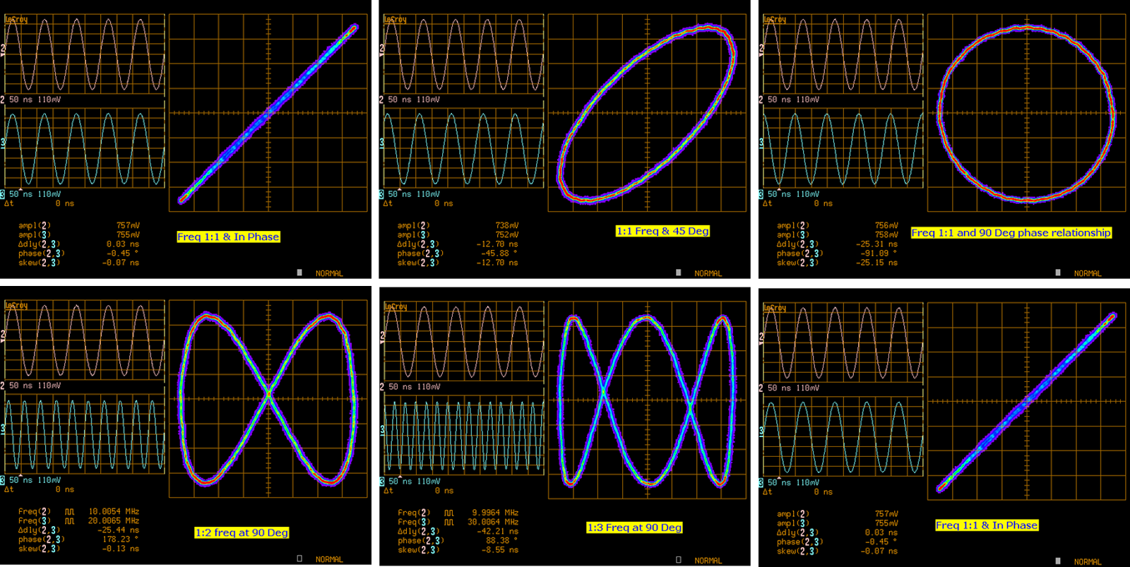
The Oscillofun song by Atom Delta is a very special piece of music has been created with the intention of playing it back both in your speakers as well as on an oscilloscope display, using the XY mode for the left and right channels. It must truly be one of very few man made signals that have this dual function, and in fact it performs relatively well in both these disciplines. In the XY mode, the oscilloscope use the two inputs to form different Lissajous patterns depending on the type and phase of the input signals. For example, two sine waves in phase are shown as a straight line, while two sine waves that are 90 degrees out of phase are shown as a circle (or ellipse if the amplitudes are not the same).
Using the algorithm described above with the Oscillofun song, we get a quite convincing animation of how an analog oscilloscope would display it. The YouTube video below has been rendered at 60 frames a second in 4K resolution. It is recommended to use the 4K quality setting even if viewing it on a lower resolution display, this is because of YouTubes compression algorithm has a tendency of blurring and creating artifacts on such sharp and fast moving lines when using a lower quality setting.
Code can be found here: https://github.com/RandomDude4/PhosPersPlot